The Web is ready for your fingerprint, almost…
About a month ago, the W3C unveiled the Web Authentication API (WebAuthn), which is a way to sign into websites using a fingerprint or other secure method instead of a password. This is brand new stuff and exciting because passwords are terrible!
The success of a new standard like this will depend on it being easily usable by people of all different levels of experience with the Web. So, instead of focusing on the technology here, I want to take a look at how it works in practice.

So what browsers even implement WebAuthn?
CanIUse has a good rundown of browser support for WebAuthn at the moment:

You’ll notice a few major gaps there—Safari, basically no browser on iOS (Mobile Safari, Firefox, and Chrome aren’t supported), and only the latest version of Edge. The bright spots are on desktop and Android where Chrome and Firefox both have support, though as you’ll see below, supporting the standard and having it actually work in practice are two different things.
Update: it looks like Safari is getting WebAuthn very soon. Thanks for the heads-up Stuart
Update 2: And they’ve done it in the Tech Preview release (May 29)
While support is growing, WebAuthn is still difficult to use
Despite the spotty browser support, I wanted to see how it worked in the browsers that it’s implemented in. I used this demo site at WebAuthN.org for testing.
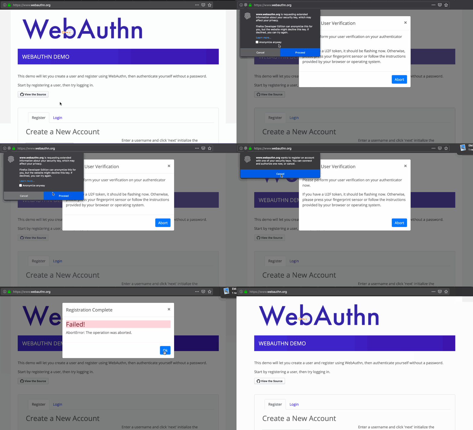
Firefox Developer Edition: Scary text and misleading icon

- The wording is really confusing. Phrases like “extended information about your security key, which may affect your privacy”, “the website may decline this key”, “Anonymize anyway” are scary technical terms. I’m a programmer with 20+ years experience and it’s not even clear to me why there’s a security risk. I know this is bleeding-edge technology, but surely Firefox can do better to hold the user’s hand through the process.
- Crossing my fingers, I click “Proceed”.
- Despite the “fingerprint” icon, I guess I have to use a USB key? The touch sensor doesn’t work in Firefox on macOS yet. It’d be nice to test the whole flow, but the wording of the message and having to agree to a security warning every time you want to save your identity on a site is a bit of an impediment.
Chrome on macOS: Very technical feeling

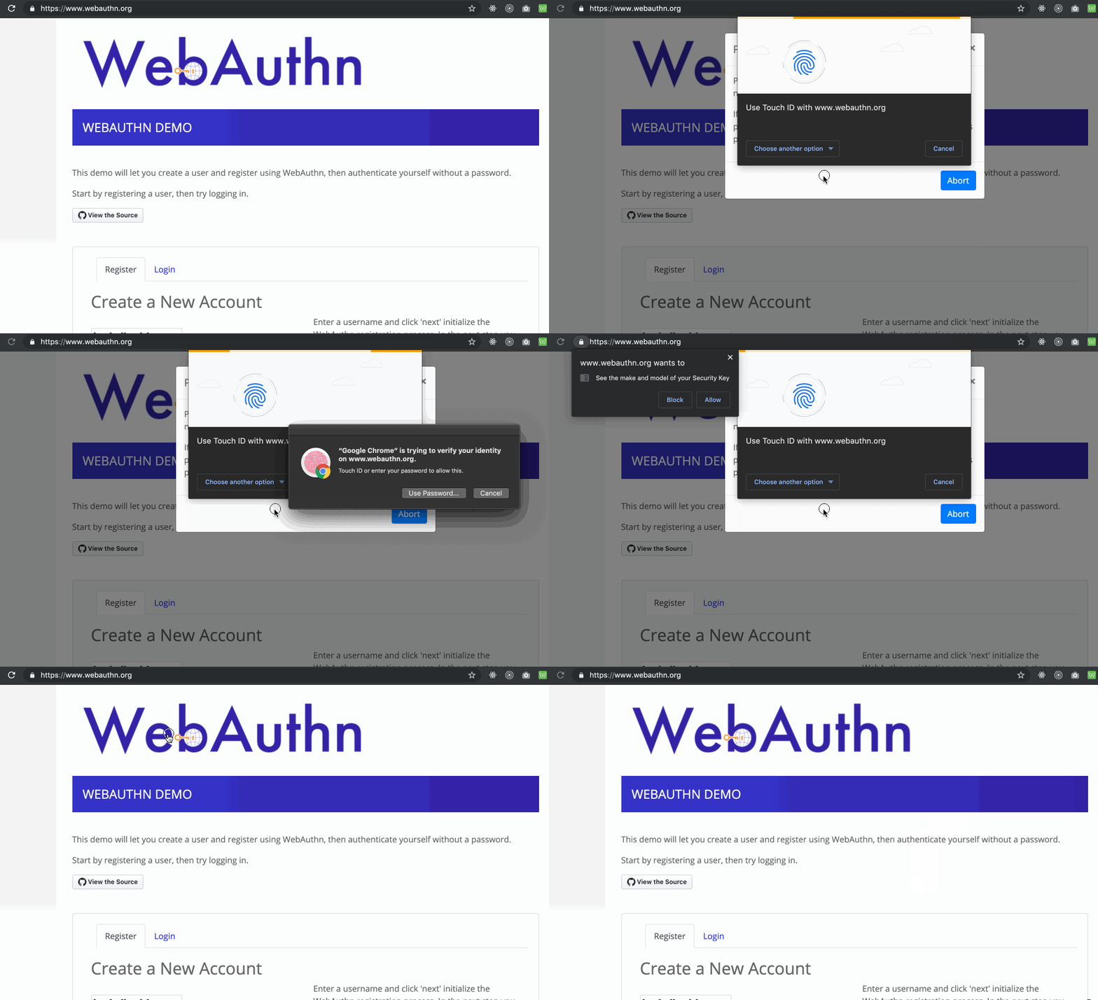
- Pop-up 1: Pretty decent start really. I chose “Built-in sensor” to use my MacBook Pro touch sensor.
- Pop-up 2: “Google Chrome is trying to verify your identity.” This is the standard screen I get on macOS whenever I use my touch sensor.
- Pop-up 3: “WebAuthn wants to / see the make and model of your Security Key”: Hmmm… now I have to authorize the website to use it? Even though I’ve chosen twice already to proceed. And I didn’t choose to use a “Security Key”, I’m using Touch ID. Confusing.
- And… it fails. Maybe the WebAuthn.org demo is out of date? Maybe it just doesn’t work yet? Chrome Developers?
Chrome on Android: Better wording, but so many steps

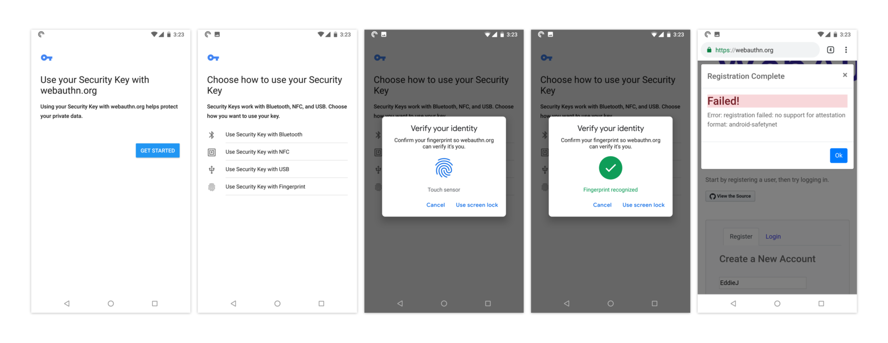
- Get Started: This is the best permission screen yet. Here you’re encouraged to proceed which is good, but then I also wonder why you even need to be asked. I’m also not sure anyone will know (or care) what a “Security Key” is in this case. The description could also be more clear and helpful about what you’re actually doing. I’ve offered an example in the “The wording should be way less technical” section below.
- Using your fingerprint must be the main use-case here, but they still make you choose. Maybe it would make more sense to just assume the fingerprint and then have a “other verification options” to the next screen?
- “Verify your identity” is a really nice screen. But “Use screen lock” is not a clear button label—and why is this a manual action after I’ve already put my finger to the fingerprint reader?
- And… not sure why it fails. But I’ll leave that to the WebAuthN.org programmers to figure out.
The initial implementation shows promise, but there will need to be more focus on usability
I realize these are the first implementations of WebAuthn and that there’s a lot of work going on right now to improve things. With that said, here are some initial thoughts on the user-experience for WebAuthn.
The wording should be way less technical
The way insecure messages are shown for security in browsers is a good model to follow for WebAuthn. Most warnings for SSL just talk about “Secure Connections” or “Your connection is not private” or warnings about “trust”. There’s little mention of the underlying technology. At the moment, WebAuthn feels like it’s only for developers and experts. The wording in the authentication and the information around it talks about USB authenticators, “security keys”, etc. Instead of talking about all of this technical jargon, the person should just be reassured with something like:
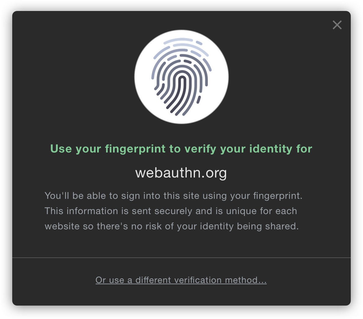
Use your fingerprint to verify your identity
You’ll be able to sign into webauthn.org using your fingerprint. This information is sent securely and is unique for each website so there’s no risk of your information being shared.
Or use a different verification method…
Authorizing WebAuthn per site should be easier
It’s unfortunate that I’m asked multiple times whether I really (really) want to
use WebAuthn on each domain I visit. When you consider the current state of
passwords in browsers, anything is an improvement. Currently, passwords are
implemented with <input type="password"> that sends the password in plain text
and I have to
hope that the developers who implemented on that particular site use decent encryption on their end to store it.
I shouldn’t have to jump through hoops to use something that’s so much better
than that out of the box.
Ideally, it would just jump straight to a fingerprint validation step without having to ask for my permission to first allow for the use of WebAuthn. If the “permission” step and the “auth” step could be combined, it would be more in line with how apps like 1Password use fingerprint authentication. Ideally it wouldn’t need to be authenticated in the same way that Geolocation API does due to privacy. It seems that the most the website could get would be a unique identifier for me, so I wonder if Webauthn could just be enabled by default. That said, there may be valid reasons to first have to give permission.
At the very least, the number of pop-ups and permission steps could be reduced. Having to be given info, then agree, then choose a method, then input your fingerprint, then receive confirmation, is too many steps.
Choosing an authentication method should have a default
The options to choose a USB-key, NFC, or Bluetooth are confusing. I realize that there’s a good chance that the Firefox, Chrome, and other developers are starting with the use-case that’s the most prevalent for them internally and will circle back later to address the rollout of WebAuthn for everyone. Hopefully the next iteration will start to make those authentication options less in your face.
USB keys for authentication will almost certainly never be used by home users where authentication (at least for now) will be via fingerprint sensors on laptops or phones. Having to choose an authenticator is confusing for the vast majority of people who don’t even know what that is, and the default should be obvious—those with USB keys or other auth methods can be made to do a bit more work to go to a preference (or subtle link) to enable that option.
Can’t wait until it’s ready for us to use!
I really love that the Web Authentication API is coming alive, but I worry that it will fail to be used widely if a few simple user experience improvements aren’t made. Better copywriting, fewer technical questions for users, and streamlined flows would go a long way to making the API a truly wonderful experience.

Thanks to Daniel Burka and Steven Garrity for their input and editing on this article!
