A brief (18-year) history of silverorange.com
A look back at how our silverorange.com website has changed since 1999.

At the 18th anniversary of the founding of silverorange, we've been looking back at how our silverorange.com website has changed with our business.
We’ve always kept our silverorange website intentionally simple. First, it exemplifies how we value simple, fast, and effective websites over heavier and fancier alternatives. Second, we wanted to avoid the usual “tell the world what great work you do” and to instead let our work and reputation tell the story.
Here’s a quick look at our silverorange.com website through the ages.
v1.0: The Beginning (1999—2000)
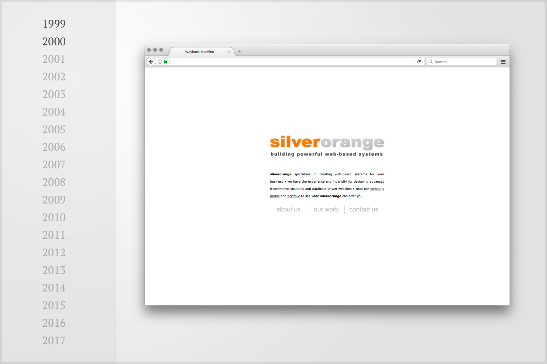
The first iteration of our website was build in
ColdFusion on the back-end,
with a few simple pages. The layout fit nicely into a 640×480 screen, but
floated comfortably in the middle of a luxurious 1024×768 display (thanks to the
powerful HTML <table> ).
Internet Explorer 5 was the
state-of-the art web browser.
v1.1: Frames! (2000—2002)
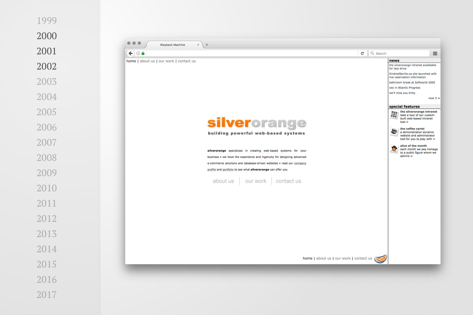
While we were apparently still happy with the original style of our site, we needed room to showcase our news and special projects. With the astounding but controversial power of HTML Frames, we kept our existing simple site, but added a sidebar. Here, we showcased our in-house web-based team communication tool, the silverorange intranet (think Slack, but with the tech of 1999).
v2.0: Pixel-sharp (2002—2008)
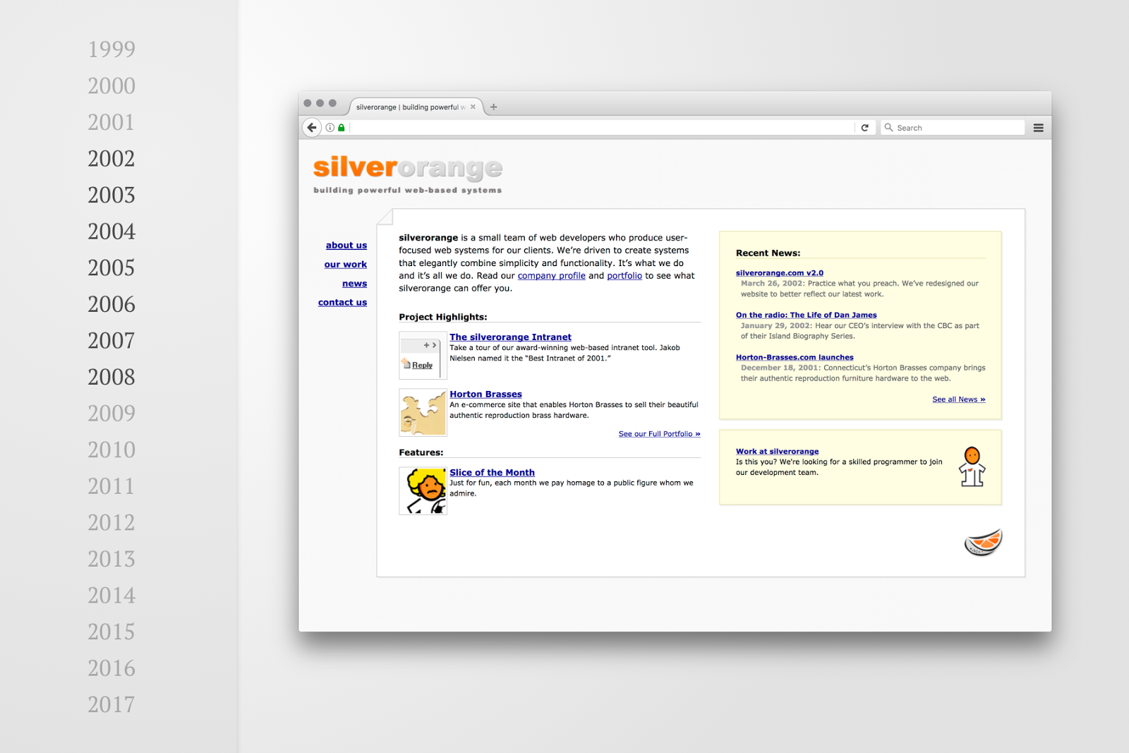
In 2002, we significantly redesigned our site, with a crisp, pixel-sharp style
and flexible layout (still <table>-based). This style is a personal favourite
of mine and served us for six years with only minor updates. The site also
transitioned from ColdFusion to PHP on the back-end—a good move, in
hindsight.
v3.0: The Darkness (2008—2014)
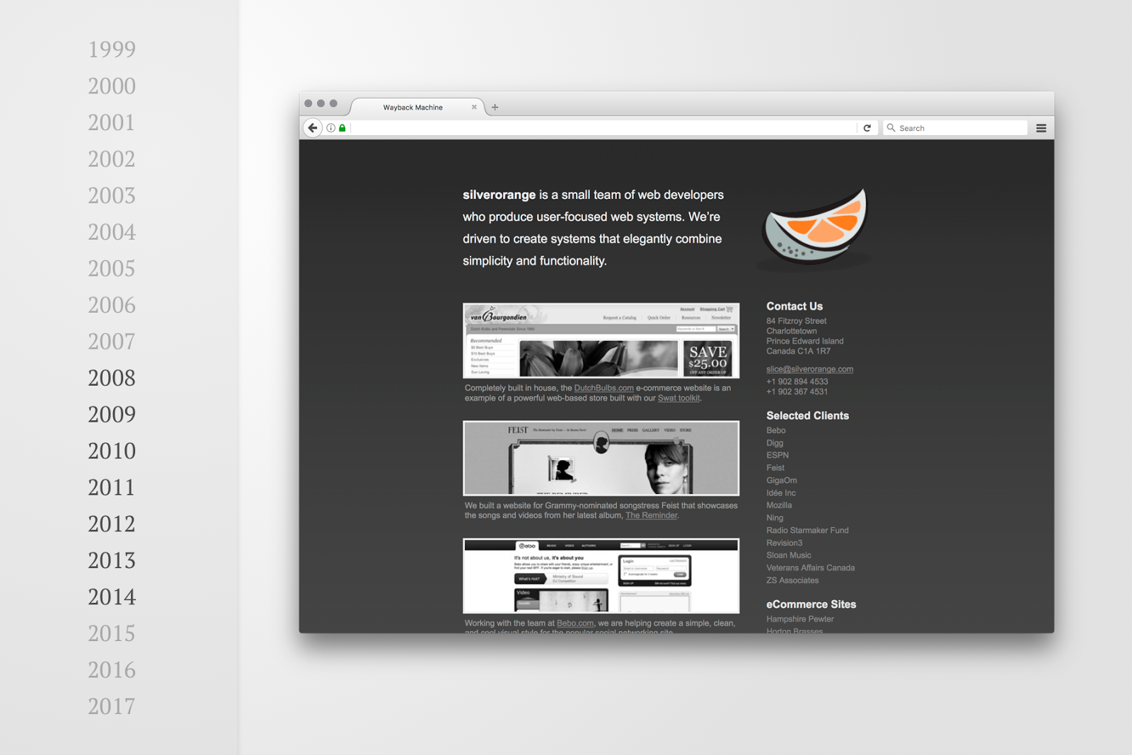
In 2008, the global financial system collapsed, which we unintentionally reflected in the dark tone of our website redesign. This design showcased clients of the time including Feist, Sloan, Bebo, Digg, Mozilla, and Duolingo.
v3.5: Cards (2014—2016)
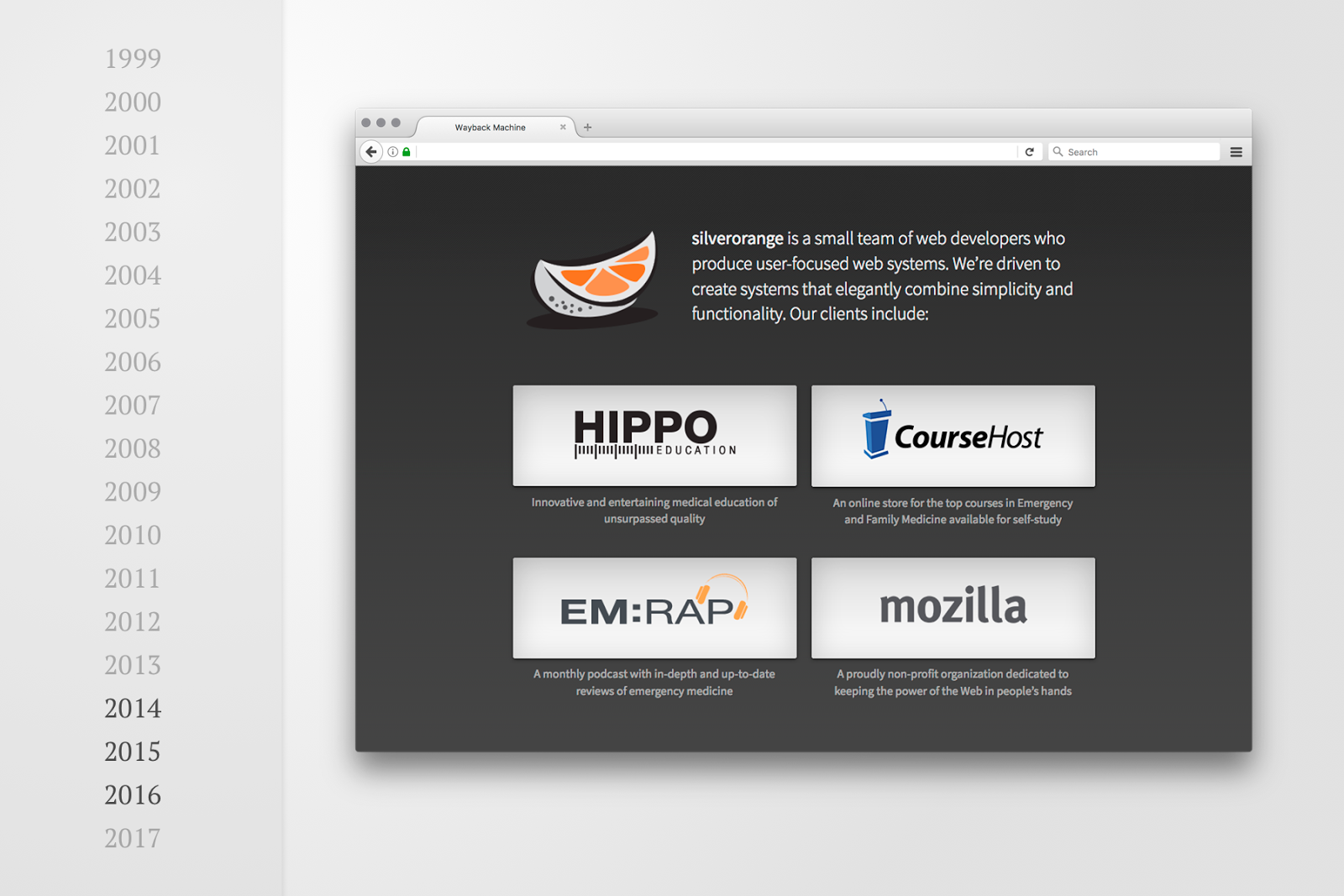
In 2014, we kept the dark tone (and subtle, but internally controversial, pin-striped background) and redesigned with our first mobile-friendly responsive version of the silverorange site. This version was intended to show our core set of long-term clients, and implicitly suggest that we weren’t looking for new clients at the time.
v4.0: Single Page App (2016-PRESENT)
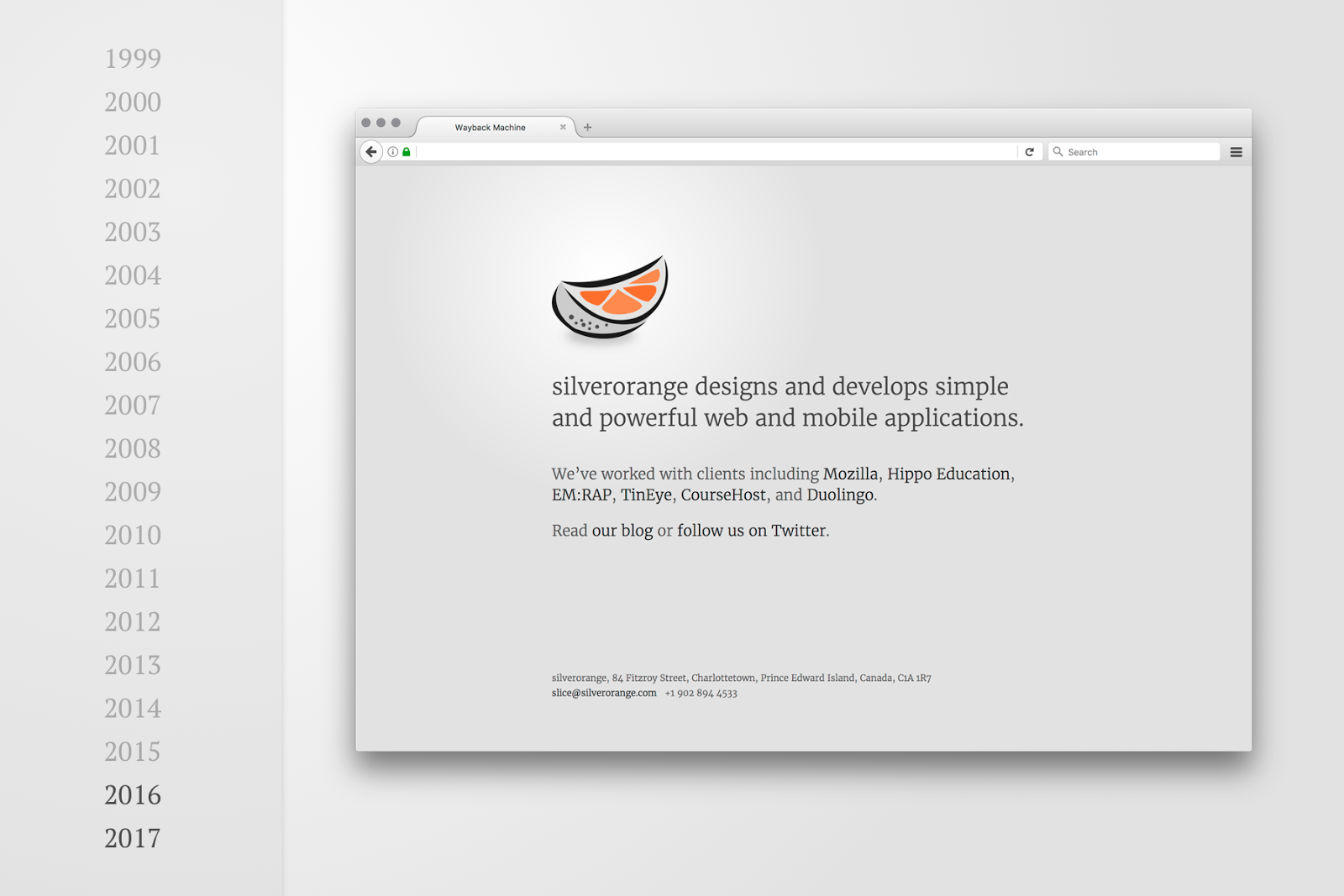
In 2016, we redesigned with the simplest version of our site since it’s launch in 1999. Unlike the more elaborate single-page applications (SPA) we’ve built for clients with tools like Ember and React, this site is literally just a single page of static HTML.
With this redesign, we limited ourselves to a result that would be quick to implement and easy to maintain. The two key use-cases I had in mind during this redesign were:
- A potential client looking to contact us.
- Me, looking up our postal code.
I can confirm that the design has at least addressed that second use-case.
We’ve since added a few pages to highlight when we’re hiring, but the basic main page still serves us well. We rely on our @silverorangeinc Twitter account and blog.silverorange.com (hosted via Medium) to share more about our company.
v4.1, 5.0, & Beyond (the glorious future)
Our current brutally simple site continues to serve us well enough, but I’m sure we’ll look to update and expand it at some point. Maybe we’ll use WebVR.
