Usability for Promotion Codes and Access Codes

How many codes do you deal with every week? Between promotion codes, access codes, student IDs, and two-factor authentication codes, entering gibberish text has become part of our everyday. But if you’ve ever tried typing out an Amazon gift code or software license code, you know that not all codes are created equal.
We recently started a project at silverorange with the non-profit Computers for Success Canada. A consideration of the project is to generate a unique code that can be read off paper, typed into a web-form, and spoken over the phone. Simple enough, right?
We’ve always focused on highly-usable UX and UIs, so designing a simple code is right in our wheelhouse. But when we started researching usability best practices for promotion/access codes, it was surprisingly difficult to find any. There are tomes written about designing for security, but what does it matter if your users can’t use them? So we put our brains together and worked with literacy and essential skills consultant Gillian Mason to design our own access code best practices.
Main Goals
Keep in mind that the use-cases for the codes are to be read, temporarily memorized, and then typed or spoken. With this in mind, the most usable codes should be:
As short as possible: Short codes are easier to memorize, quicker to type or say, and offer less chance of making mistakes. Imagine if you (presumably an English speaker) were asked to type 8 characters in hiragana: ぎまひせお. It’d take you a long time per character to type. That’s what the Latin alphabet is like for many people.
Easy to read: Remember that a significant portion of the population has low literacy skills or speak another language than the one of your site. Use characters that are as easy to recognize as you can.
As error-proof as possible: Keep the barrier to entering the code as low as possible and avoid the frustration of error messages.
Hard to guess: Balance a short, easy to read code against the security concerns of your application. A four character numeric code is simple to type but far too easy to guess.

The Edge is Your Focus
For most programmers and designers who make websites, inputting a code involves a quick copy/paste or touch-typing while you read it from a piece of paper. For someone with literacy, eyesight, language, or other impediments, doing that same task can be a frustrating experience and may result in them giving up on the process.
In govt we have a moral responsibility to design for the edge cases > "Edge cases define the boundaries of who [and] what you care about. They demarcate the border between the people you're willing to help and the ones you're comfortable marginalising" https://t.co/1OMNeQN0Fz
— Kylie Havelock 🏳️🌈 (@kyliehavelock) April 10, 2018
Any code should, at the minimum, account for people who are affected by:
Visual impairment: A screen-reader, magnifying device, or other aid may be necessary to read the code.
Physical impairment: An assistive device or voice-input may be necessary to input the code.
Different languages: The Latin alphabet is not familiar to literally billions of people worldwide.
Low literacy: According to the NAAL, approximately 14% of Americans have a “below-basic” reading level and 29% have a only a basic reading level. The numbers are roughly the same in Canada.
Low digital proficiency: Many users are intimidated by web forms and technical language found in error messages or form submission.
Making it “accessible” for everyone also makes it better for everyone, regardless of your abilities or proficiencies.
Even if you don’t have a disability, but are reading your own messy handwriting, in a low-light situation, or distracted and tired, the same “accessible” features designed to accommodate the “edge” are suddenly relevant to you.
Techniques
So how do we make a code that works for everyone? Some best practices to follow are:
Avoid similar characters: Some characters look very similar such as 0 and
O, 1 and I. For a base to start from, we suggest an alphabet of
0123456789ABCDEFGHJKLMNPRTVWXYZ which notably excludes IOQSU. When
validating the code, the similar characters should be automatically substituted
for their visually similar match (e.g. replace I with 1).
Homophone considerations: Let’s say you’re making a code for people who
speak two languages—in Canada, often French and English. Amazingly, when
spoken, the letters G and J sound reversed in those two languages. I is
pronounced as a long ē in French. You may need to remove these characters from
your alphabet.
Format code in groups (chunks): The NN Group has
a great article all about chunking
and why it’s cognitively easier to remember and recite chunks. For an 8
character code, you might want to format it A1 P3 8C N9 or A1P 38 CN9.
Generous kerning and spacing: Characters that are too close together can be hard to read for people with dyslexia or people not adept with the Latin alphabet.
Uppercase, sans-serif font: This eliminates interpretation/guessing associated with some lowercase letters. You could even consider using the OpenDyslexic font.
High contrast black and white: For people with some visual impairments it’s best to avoid colours. It also makes printing the code more consistent with the digital display of the code.
Code Validation Usability
When validating the code, try to solve problems automatically for the user. This is one of the most important parts often overlooked by developers. Your application should allow input of the code with either upper or lower case (and use CSS to auto-format it uppercase), auto-format the “chunks” both visually and for verification, and automatically replace incorrect “similar” characters with the matching correct character. If there’s any way to avoid showing a variation on the “Your code is formatted incorrectly” message, you should do it.
If you can’t solve the problem automatically, don’t just say “Your code is
formatted incorrectly” when the person submits an invalid code. Use
informative and easy to understand messages. Tell them “Your code is too
short. A correct code looks like: A1 P3 8C N9.” Is it too long? Tell them.
Whatever you can do to inform the person about the issue in as easy to
understand, non-technical language as possible, the better.
Security
One of the main goals is to have the code “as short as possible,” but in most cases you also want the code to be hard to guess, random, and non-sequential. The length of the code will depend on the number of codes you distribute and how critical code-guessing issues are to your system. The point of including this security info is to help you choose the shortest code possible for your application.
The math: To figure out the number of possible codes, just take the size of the alphabet you’re using and raise it to the length of the code. So for a 31 character alphabet:
- 31⁶ = 887,503,681 unique codes
- 31⁷ = 27,512,614,111 unique codes
- 31⁸ = 852,891,037,441 unique codes
- 31⁹ = 26,439,622,160,671 unique codes
Rate limiting: The number of codes you need will also depend on how quickly a malicious person can guess codes. Your API or form validation should keep this in mind. If you limit the validation mechanism to ten validations per second, and you give out 100,000 codes, it would take about 14 minutes to guess one correct 6-character code. For 8 characters, this increases to 14,215 minutes. If you’re using a second validation criteria such as email, guessing the correct code becomes much harder again. (I realize botnets could guess faster, but you’ll have to figure out your own risk tolerance for such scenarios)
Brute-force and timing-attacks: In case someone gets access to your codes in the database, you can protect them in much the same way you protect passwords. AES or Blowfish encryption make it programmatically slower to guess codes. For validation code (such as an API) you should use a comparison function that always takes the same amount of time to verify will protect against timing attacks.
Interesting Examples
Our simple implementation

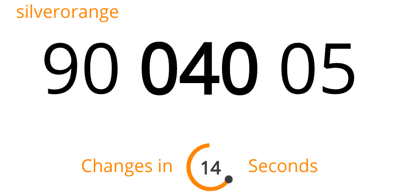
Authy
The Two Factor Authentication application Authy uses chunking and bold text to format the code:
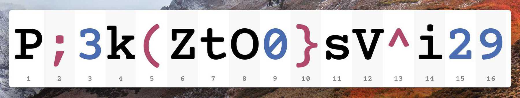
1Password
The popular password manager 1Password uses colour to differentiate numbers from letters and symbols. We recommend using black and white for most cases, but it’s interesting what 1P does. Their use-case is a little different than ours in that they don’t restrict the alphabet so differentiation is even more important for them.
Next Steps
The next phase of our project is to do additional research with other accessibility consultants and real-world testing with a wide variety of differently abled people. When we’re done, I’ll post an update here with the results.
More advice or examples?
Due to the lack of information out there, our team at silverorange has mostly developed these ideas on our own and with the help of Gillian Mason. I’m sure there are lots of other people out there who have thought long and hard about these issues and have more recommendations or ideas. I’d love to hear about them.